A simple example of Multidimensional Scaling with R and Gephi
Introduction
During my PhD project I developed a fascination for geometric approaches to exploratory data analysis, such as Multidimensional Scaling (MDS) and Correspondence Analysis. These methods have some very interesting applications. For example, they can help you to strongly reduce the dimensionality of datasets, capturing the most essential patterns in your data. I especially like the ways in which these methods can help you to visually explore concepts that can be captured in terms of ‘distances,’ such as (dis)similarities between people, social groups, events, and etcetera. I thought it would be nice to write a few posts in which I offer basic examples of the methods in use (without going into the technical details), using only open source software. In this post, I focus specifically on MDS, and I offer a basic demonstration of the method, using R and Gephi, two amazing pieces of software.
A very brief introduction into MDS
Let me first say that I am not going to give an in-depth methodological introduction into MDS. I like to keep things at an intuitive level for this post (and I am likely to do so in future posts on this topic). There are plenty of books that offer a great technical introduction into MDS, including Kruskal and Wish (1978) (I love those little green books on Quantitative Applications in the Social Sciences) and Gatrell (1983) (oh, the smell of old books). I should also say that there is more than one type of MDS. For example, there is the distinction between metric and non-metric MDS. I am not going into all these nuances either, but I can at least share with you that, in the example below, I am applying non-metric MDS.
Basically, what MDS can do for you is to take a matrix in which the distances between a set of entities are recorded (i.e., a distance matrix), and try to create a low-dimensional spatial configuration in which the same entities are located in a way that the distances between them are proportional to the distances in the original distance matrix. This may sound trivial, but keep in mind that some types of distances may be very difficult to accurately reproduce in a low-dimensional space. For example, I have experimented with using MDS to visualize the (dis)similarities between social events, based on the actors and issues (e.g, problem and solution definitions) that the events have in common. I usually ended up needing at least 6 dimensions to accurately express these (dis)similarities. Unfortunately, it is impossible to visualize any space with more than three dimensions in one picture, and trying to do so is a serious threat to your mental health.
At this point, some of you might already wonder how we can decide the number of dimensions that we need to accurately represent the contents of a given distance matrix. MDS comes with a measure called ‘stress,’ which you can interpret as a measure of fit between the spatial configuration produced, and the original distance matrix. The higher the stress, the worse the fit. In other words: The higher the stress, the less confidence you should have that the spatial configuration you produced accurately represents the distances in your original distance matrix. Kruskal and Wish (1978) offer an insightful discussion on stress, and on different rules of thumb on how to interpret stress values. A very rough rule of thumb is that stress values below 0.10 usually indicate a good fit, and that values above 0.20 are unacceptable (but don’t cite me on this!).
Our example of today
The example that I will be using is a bit silly, but it serves quite well to show how powerful MDS can be at creating spaces that accurately reflect the distances that you feed into the analysis. For this example, I have taken 12 cities in the Netherlands, and I looked up the distances between all of them. To find the distances, I used this website (thank you, Google). See the distance matrix that I produced below (some of the larger pictures in this post may be easier to read if you click on them).
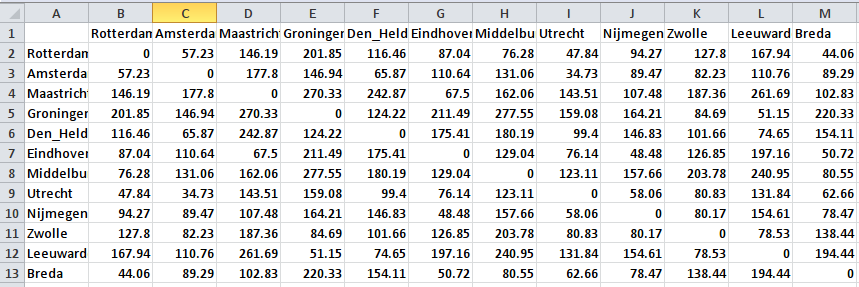
There is no particular reason why I picked these cities, except for the fact that they are spread out quite nicely throughout the Netherlands. I already know that it will be very easy to represent these distances in a 2-dimensional space, because that is what we do all the time with geographical maps. So the results will not be very surprising, but I still think the results are cool enough.
Let’s get to work!
So, let’s do this! The first thing I did is to save the matrix shown above as a comma-delimited file (.csv extension), because it is easy to import such files into R. If you don’t know how to do this, go to ‘save as’ in Excel, and find comma-delimited in the file options. Comma-delimited files are basically text-files that use commas, or other symbols, to separate columns. I always use semicolons ‘;’ as separators, but you can use whatever you like.
Next, we start up R. My R-session may look at bit weird to you, because I embedded R in Emacs, using Emacs Speaks Statistics, and that is just because I am a nerd. You can of course use the standard GUI for R if you like. R comes with built-in functions that can do MDS, but I like to work with a package called ‘vegan.’ I already had the package installed, but if you don’t, then you can install the package by typing install.packages(“vegan”) into the R-console. After that, you can activate the package by typing library(vegan).
After starting R, I imported the csv-file as a matrix object (see picture further below for a log of all the commands that I used). I called the matrix geoMatrix. After importing the file, I immediately turned the matrix into a so-called dist object (called geoDist), which is something that R uses to store distances. This is also the object that I fed into the MDS analysis.
The ‘vegan’ package comes with a function called metaMDS(). The function takes a lot of arguments, but most of them have default values, and for our example these default values will work just fine. There are two arguments that I would like to draw your attention to: The first argument to the function should be the distance object that you want to use as the input for the MDS analysis. There is another argument k, which indicates the number of dimensions that you want the spatial configuration to have. The default value for k is 2, which is fine for us. However, if you find that with this default value you end up with high stress values, then you might want to consider increasing the value of k. You would then, for example, use the function with the following arguments: metaMDS(geoDist, k = 3).
I use the function with the geoDist object as the only argument, and I tell R to assign the results of the function to an object called geoMDS. The function will start an iterative process in which it attempts to come up with increasingly accurate spatial configurations, and it will spit out the stress value that it ends up with at each run. By default, this function will make up to 20 attempts to come up with a decent configuration (this is also something you can change by changing the arguments given to the function), but in our case the function already reaches a very low stress value at its second run (see log below).
I immediately plotted the resulting configuration, using the standard plot() function. To assign labels to the points in the visualized configuration, I used the function text(). See the screen shot below for a log of all the commands I used (including the arguments given to the different functions) on the right, and the plot of the resulting configuration on the left (if you look below the visualization, you’ll see that I was checking out a discussion on calculating stress in R, just before doing the analysis).
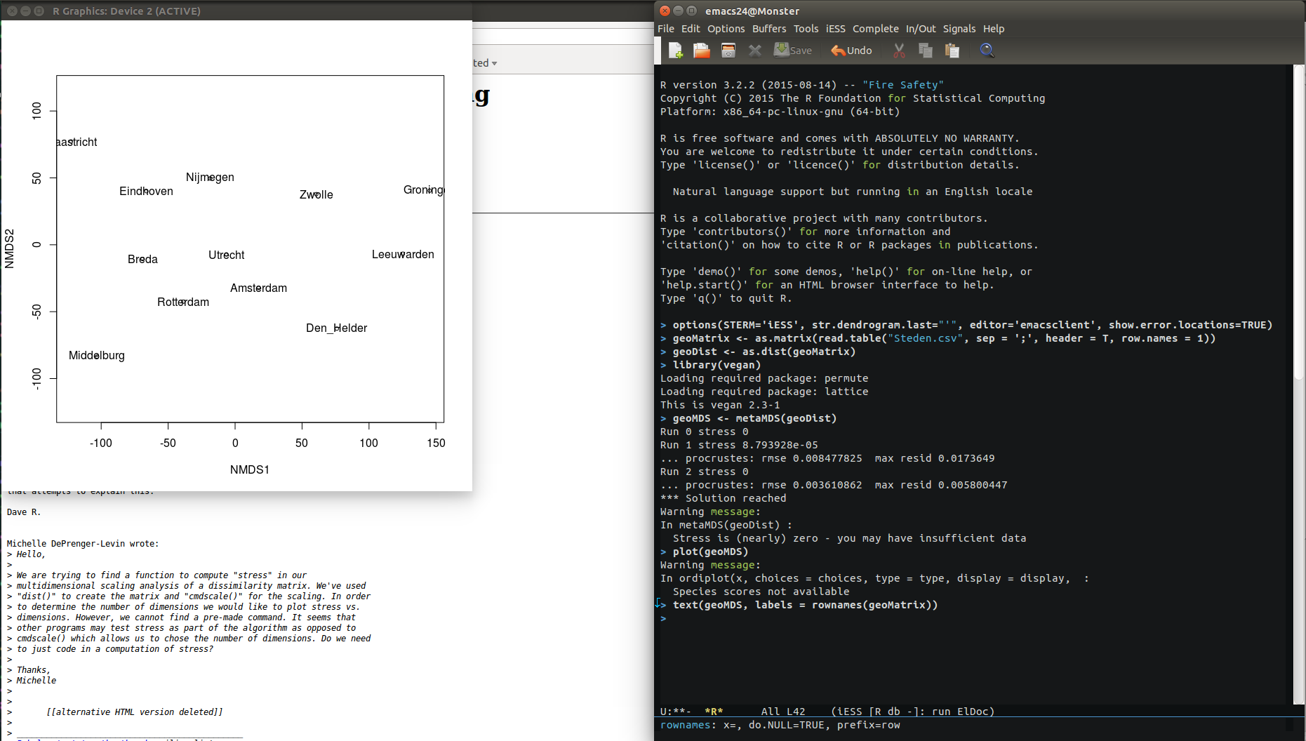
After a visual inspection of the results, I decided that the distances seem pretty close the actual distances you will find on a map. However, the layout of the cities is a bit counterintuitive. Also, the orientation of the space is different from what we are used to with geographical maps, so I decided to import the data into Gephi, and change the layout there, without changing the distances.
Importing the data into Gephi
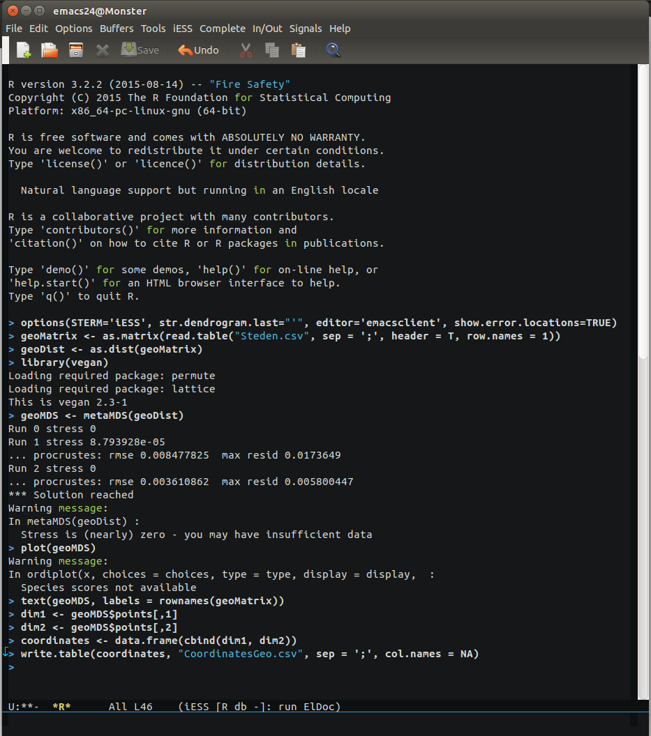
To do this, I first had to export the coordinates of all the cities in the new space that the MDS analysis created for them. These coordinates are stored somewhere in the geoMDS object. This object has a rather complicated structure that I do not want to get into, and I do not expect you to immediately understand the trick that I use to extract the coordinates from the object. However, let me tell you what I did: I created two new vectors (one for each dimension). The first vector holds all the coordinates in dimension 1, and the second vector holds all the coordinates in dimension 2. In the geoMDS-object, these coordinates are stored in what can be understood as a ‘sub-object’ of geoMDS, which is called ‘points,’ and which is basically a two-column matrix (1 column for each dimension). All coordinates in dimension 1 are stored in the first column, and all coordinates in dimension 2 are stored in the second column. So, if you understand the basics of R, you may also understand that we can access the coordinates in each dimension with the commands geoMDS$points[,1] (for dimension 1) and geoMDS$points[,2] (for dimension 2). After putting the coordinates in two separate vectors, I assembled the vectors into a data.frame. Then I wrote the data.frame to the disk, using the write.table() function. I wrote the results to a file that I named “CoordinatesGeo.csv.” See the screen shot below to see the commands that I used.
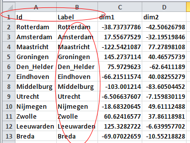
Before we can import the resulting file in Gephi, it needs some minor changes. Without changes “CoordinatesGeo.csv” is a table with three colums: One unnamed column with the names of the cities, and two named columns with the coordinates that we created with our MDS analysis. I turned this table into a Gephi nodes list by naming the column with city names “Id”, and by copying this column to a second column that I renamed “Labels” (see screen shot below).
Now we start up Gephi. In Gephi, we start a new project, and we go to the data laboratory. There, we use the ‘import spreadsheet’ function (see below).

Importing a spreadsheet. </div>
This will open a new dialog, where we can indicate how we want to import our data. One thing is very important here, and that is that we want to import the coordinates as numerical data. I usually import numerical data as doubles (see below).
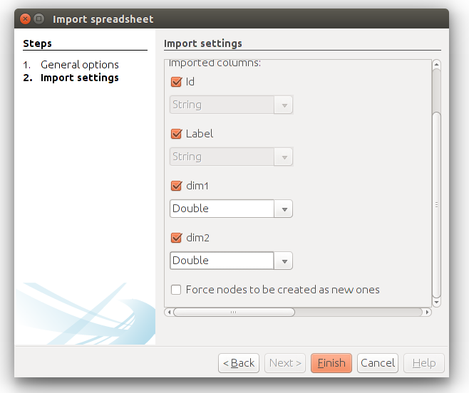
If the settings are like shown in the screen shot above, then you should be okay. We can go back to the overview in Gephi, and the nodes will be randomly distributed in the plot screen. Gephi doesn’t come with a built-in layout algorithm for nodes that have coordinates, but you can use a plugin that I created some time ago, called MDS Layout. You should have this plugin installed before you can proceed with the next steps.
I selected the MDS Layout from the layout menu, and the plugin automatically recognizes the variables ‘dim1’ and ‘dim2’ as appropriate dimensions. The layout that is created if you run the plugin is the same as what we saw when we plotted the results in Gephi (see below).
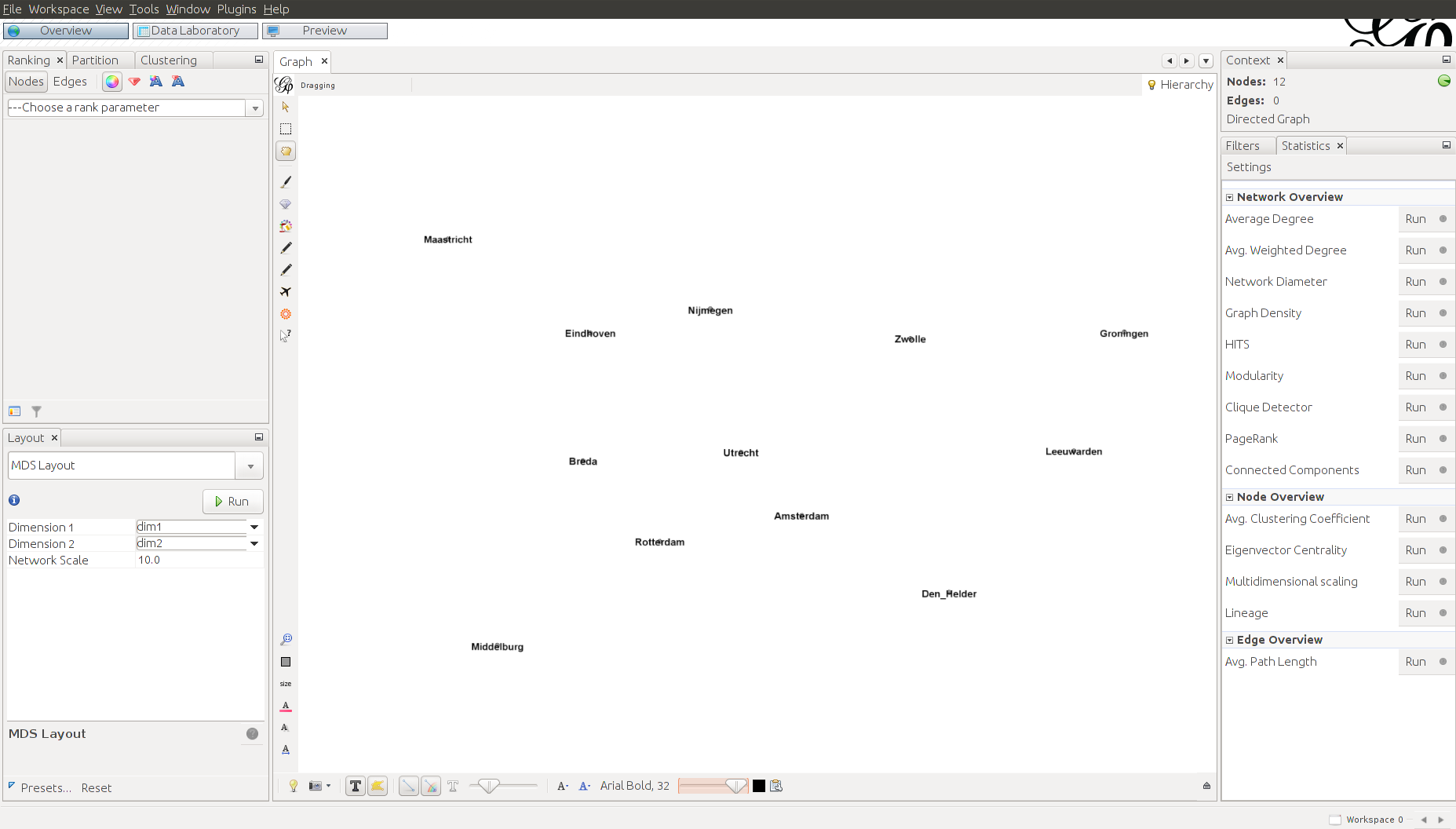
I wanted the cities to be oriented the same way as in commonly used geographical maps, and for that I used Gephi’s built-in layout algorithm ‘Clockwise rotate’ (interestingly, this algorithm rotates the nodes in the counter-clockwise direction). I set the algorithm to rotate the layout by 90 degrees. After doing that, I immediately saw that the layout of the cities created by the MDS is like a mirror image of the layout that you’ll find on a geographical map (Maastricht is in the West, while it should be in the East, and Middelburg is in the East, while it should be in the West). This is something that we cannot fix in Gephi, but we can easily fix it in Excel.
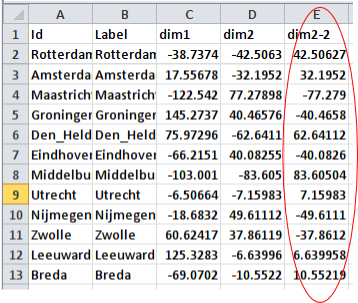
I reopened the nodes list we created earlier, and after inspecting the coordinates I saw that the coordinates in dimension 2 are the coordinates that are mirrored. To fix this, I created a new column with coordinates for dimension 2. The values in this column are the values of the original column multiplied by -1 (see below).
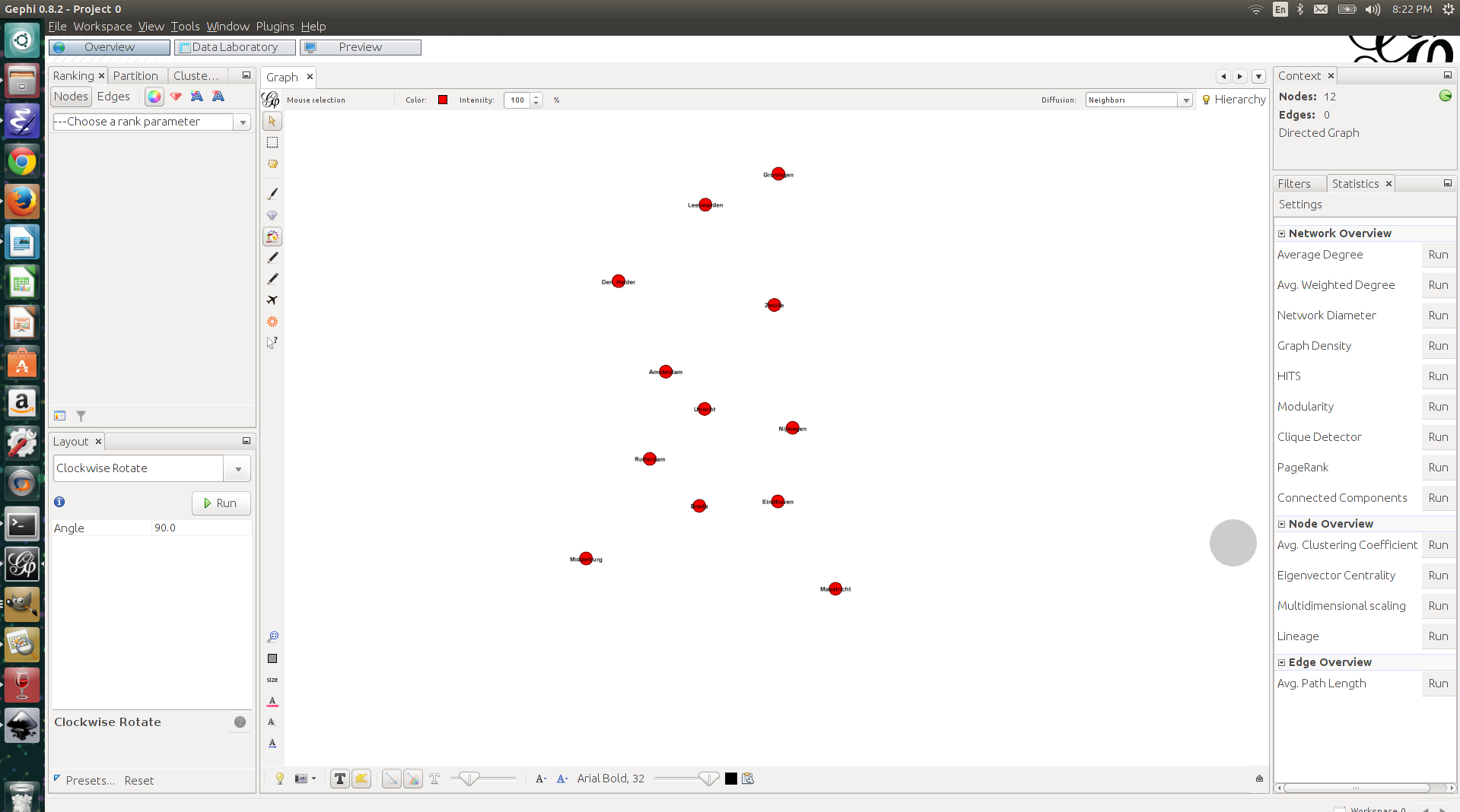
I imported the adjusted nodes list into Gephi, using the same approach as before. I used the MDS Layout again to create my initial layout. In this case too, I had to use the “Clockwise rotate” layout to rotate the layout by 90 degrees. I also increased the size of the nodes a bit and gave them a color, just for aesthetic reasons. See the result below. If you know the map of the Netherlands, then you’ll see that this is already more like it!
As an ultimate test (okay, this is a bit of an exaggeration) I decided to plot the points on top of a blank map of the Netherlands. I found such a map easily enough through Google Images. I exported the visualization from Gephi as an SVG-file, such that I could adjust the positions of the labels (the city names) in Inkscape (another wonderful piece of open source software). After adjusting the labels, I exported the result as a PNG image. I then opened the blank map of the Netherlands, as well as the PNG file with the cities in of the Netherlands in Gimp (yes, yes, open source) and pasted the cities on the blank map. It took some rescaling and additional rotating to get the layout right, but ladies and gentlemen, the result looks very, very nice.
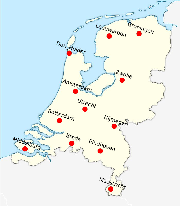
Just compare the results to an actual map of the Netherlands, and you’ll see that the MDS analysis did a very good job at creating a spatial configuration that accurately represents the distances that we fed into it. The main difference between the layout of the cities in the MDS space, and the layout of the cities in ‘actual’ geographic space is that the layout of the cities on one dimension was mirrored. It reminds me of those crappy Sci-Fi stories in which mirrors are portals to alternative dimensions, but as I mentioned before: I am a nerd.
Like I said, this is a bit of a silly example, but I plan to come up with more interesting ones in the future, where I will explore, for example, the application of MDS to ‘social stuff.’
Hope you enjoyed this!
BTW: Some time ago I created a plugin for Gephi that does MDS, using the path distances between the nodes of a graph as its input. The plugin produces coordinates that can be used to create layouts with the MDS layout algorithm. See here for more details.
Enjoy Reading This Article?
Here are some more articles you might like to read next: